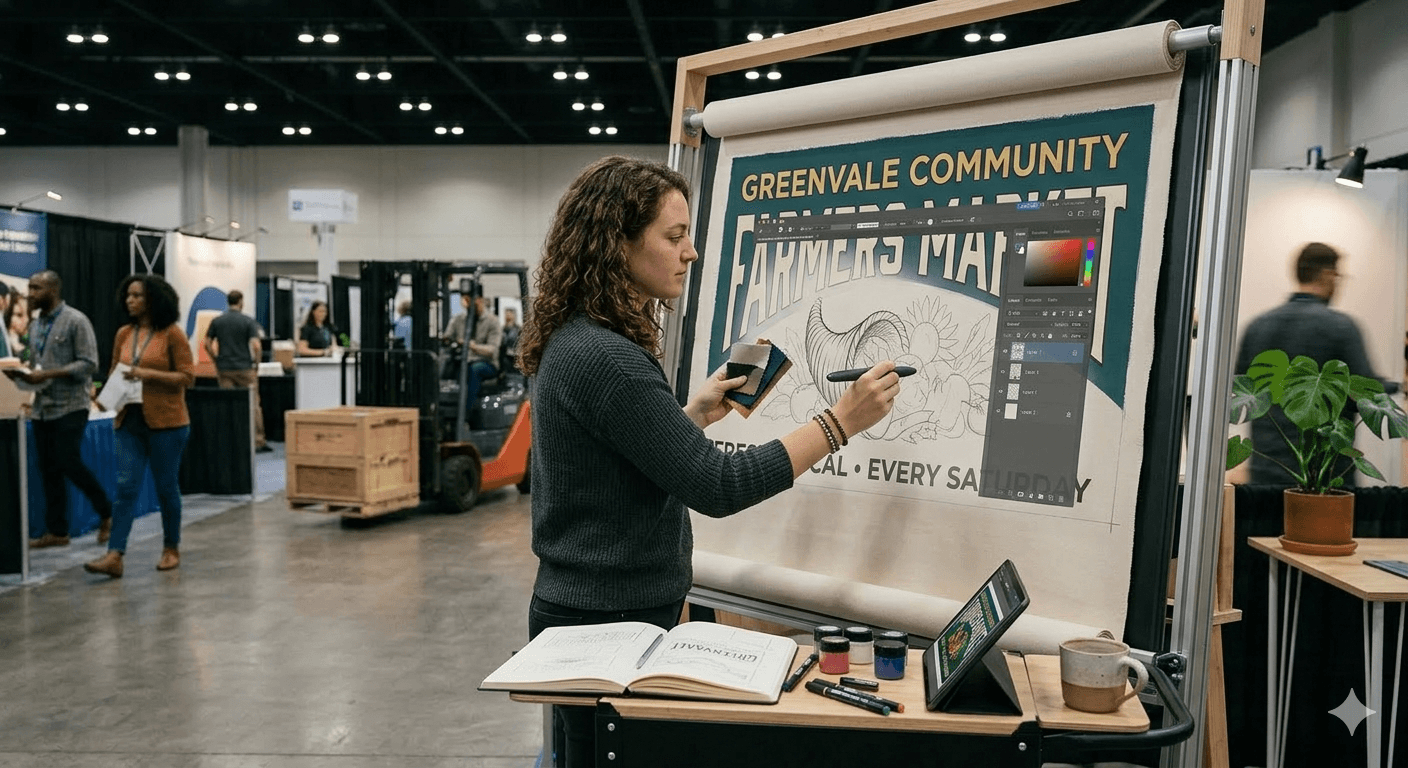
Your banner is the first thing someone sees at your booth — before you say a word, before they touch your product, before they even stop walking.
Whether you are figuring out how to host a vendor market or you are a vendor trying to stand out at your next craft fair, a well-designed banner builds instant credibility.
Here is exactly how to design a banner that works — from size and material all the way to fonts, tools, and printing specs.
Start with the Right Size and Material
Before you open any design tool, figure out your size and material. Getting these wrong means reprinting — and that costs time and money.
Banner Sizes That Work for Events and Markets
Most common banner sizes for vendor booths and outdoor events:
- 2x6 ft — great for table banners and small booth fronts
- 3x8 ft — the most popular size for booth backdrops at farmers markets and craft fairs
- 4x8 ft — for larger displays or outdoor event signage
- 33x80 in retractable roll-up — ideal for indoor events, trade shows, and pop-up markets
Which Material Should You Use?
The right material depends on where you are displaying your banner:
- Vinyl — durable, affordable, waterproof. The standard for outdoor banners.
- Fabric — premium look and feel, wrinkle-resistant. Best for indoor markets and boutique setups.
- Mesh — small perforations reduce wind resistance. Great for outdoor banners in exposed locations.
- Retractable fabric — portable, easy to set up solo, and great for events you do regularly.
Design Principles That Make Banners Actually Work
Lead with High Contrast
High contrast is the single most important thing for readability. Dark text on a light background — or vice versa — is your safest bet. If someone cannot read your banner from 10 feet away, it is not doing its job.
Choose Fonts That Read from a Distance
Stick to one or two fonts maximum. Use a bold, clean sans-serif for your main headline — Montserrat Bold, Bebas Neue, and Arial Black all work great. Script and decorative fonts look beautiful up close but fall apart at distance. Save them for packaging, not signage.
Build a Clear Visual Hierarchy
Your banner should guide the eye. Decide what you want someone to read first, second, and third. Your business name or main headline gets the most space. Supporting details like your tagline or CTA come next. Contact info last. If everything competes for attention, nothing wins.
What to Include on Your Banner
Less is more. People walking past your booth have about three seconds to absorb your message. Here is what to include:
- Business name and logo — your most important element. Make it the largest thing on the banner.
- Tagline or what you sell — one clear line that explains your product or service.
- Call to action — something like "Try a free sample," "Order here," or "Follow us @handle."
- Social media handle or website — people who want to follow up later will look for this.
- QR code (optional) — links to your online store, menu, or sign-up form.
If you are still building your vendor presence, you can find vendor opportunities on Events Near Me — new markets are always looking for quality vendors.
For market organizers, collecting vendor info is much easier with a structured farmers market vendor application process — so you know exactly who is showing up and what space they need.
Best Tools to Design a Banner
You do not need to be a graphic designer. These tools make banner design approachable for anyone:
- Canva — free, beginner-friendly, with tons of banner templates. Best starting point for most vendors.
- Adobe Express — a step up from Canva with more brand control and font options. Free tier available.
- Adobe Illustrator — the professional standard for print-ready, vector-based designs.
- Figma — great if you already use it for other design work. Strong free tier.
- Vistaprint / GotPrint — online print services with built-in design tools. Convenient if you are printing with them anyway.
Most print shops want a high-res PDF or PNG at 150-300 DPI. Always check their specs before finalizing. And if you need vendor application templates to pair with your booth setup, Events Near Me has those ready to go.
Outdoor vs. Indoor Banner Design Tips
Outdoor Banners
Use vinyl or mesh rated for outdoor use. Ask your printer for UV-resistant inks — direct sunlight fades colors faster than you would expect. Add grommets every 2 feet so the banner can be secured tightly and will not flap in the wind.
Indoor Banners
Fabric and retractable banners shine indoors. You have more color flexibility since you are not fighting sun glare. Retractable stands are the most versatile — they set up in 60 seconds and fit in a carry bag.
Common Banner Design Mistakes
Too much text — if you need more than 10 words to explain what you sell, edit harder. Low-resolution images — always use vector logos or images at 300 DPI minimum. Too many colors — stick to 2-3 brand colors maximum. Centered everything — try left-aligned or asymmetric layouts for a more dynamic look. Forgetting a CTA — always give people one clear next step.
Running a market and need more than just great signage? Market management software handles vendor applications, booth assignments, and communications — so your event runs as professionally as your banner looks. Check out the craft market software options built specifically for organizers like you.
Ready to manage your market without the headaches? Events Near Me is free to get started — built for market organizers who want to spend less time on admin and more time on the market floor.